A
AlSanta
Member
- Beiträge
- 7
- Punkte Reaktionen
- 0
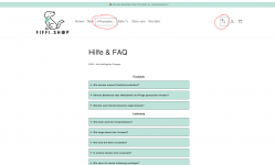
Hallo lieben Community, ich bin aktuell dabei einen shopify store aufzubauen und habe auf einer Seite (FAQ-Seite) einen CSS Code eingebunden und angepasst. Leider bin ich absoluter Laie und der Code veränder auch ungewollt zwei Stellen im Header. Der Header soll aber von dem CSS Style unberührt bleiben. Kann mir jemand weiterhelfen? Hier ist der Code, den ich auf der Seite eingebunden habe:
"<style><!--
/* Grundlegende Styles */
body
{padding: 2rem;}
details {background: #FFFFFF; border: 1px solid #121212; border-radius: 3px; margin-bottom: 1.5rem;}
summary {background: #BEE3DA; color: #121212; cursor: pointer; padding: 1rem;}
.akkordeon-inhalt {padding: 1rem 1rem 1px 1rem;}
summary::before {
padding-right: .25rem;
content: '+ '; font-size: 2.1rem; font-weight: bold; /* Instead of Triangle closed */
}
details[open] summary::before {
padding-right: .25rem;
font-style: italic;
content: '- '; font-size: 2.1rem; font-weight: bold; /* Instead of Triangle open */
}
/* Styling the summary in case of open 'details' */
details[open] summary {
font-style: italic;
border-radius: 3px 3px 0 0;
}
/* Der verzögerungseffekt */
details[open] summary ~ * {animation: sweep .5s ease-in-out;}
@keyframes sweep {
0% {opacity: 0; margin-left: 0px}
100% {opacity: 1; margin-left: 0px}
}
--></style>"


")